
Introduction: The “Lumina” Design Sprint
As the founder of Dzine Flow and someone deeply entrenched in the world of AI and startups, I am constantly battling the same bottleneck: Creating “Aesthetic Intelligence” at speed.
In 2026, clients don’t just want wireframes. They want “Vibes.” They want glassmorphism, ambient glows, and emotional resonance — and they want it in the first meeting.

Recently, I challenged myself to a Design Sprint for a fictional product concept: “Lumina,” a next-gen Smart Home control hub.
- The Goal: Create a “Zen Mode” interface that feels organic, calming, and premium.
- The Constraint: No starting from scratch. I had to use AI to generate the Ideation, the High-Fidelity UI, and the Prototype.
- The Contenders: The industry standard (Figma Make), the rapid wireframer (Uizard), and the new challenger (Moonchild AI).
Here is the deep dive into how they performed.
1. The Winner: Moonchild AI
Verdict: The only tool that acts like a Senior Product Designer.
I started with Moonchild. My expectation was a static image generator, but the workflow felt like a collaborative session with a partner.
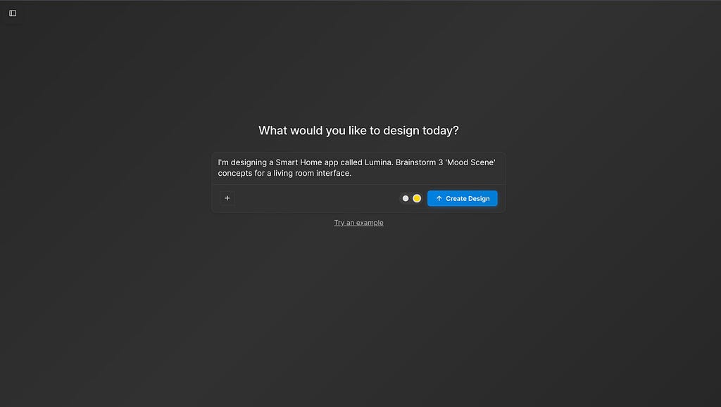
Phase 1: Deep Ideation (The Brainstorm) I didn’t start with pixels; I started with intent. I opened the chat and prompted: “I’m designing a Smart Home app called Lumina. Brainstorm 3 ‘Mood Scene’ concepts for a living room interface.”
Most AI tools would just give you a generic list. Moonchild returned a thoughtful UX strategy. As you can see below, it suggested “Mood Scene 1: Cozy Haven,” describing it as “unwinding… soft light, warm hues, and a comforting atmosphere.”.
It didn’t just give me a layout; it gave me the emotional logic behind the UI.
 Moonchild acted as a UX strategist, suggesting “Cozy Haven” and “Zen Mode” concepts before we even touched a pixel.
Phase 2: High-Fidelity Engineering (The Gold Dot) This is where the platform separates itself from the pack. I selected the “Zen Mode” concept. Before generating, I ensured the Gold Dot was toggled ON in the input bar. This is Moonchild’s “High-Fidelity Engine,” designed to handle complex textures like glass and blur.
I asked for a “Dark mode interface with glassmorphism sliders and warm ambient glows.”
The result was striking. It generated a screen titled “Zen Mode: Find your inner peace”.
- Visual Atmosphere: It nailed the “Ethreal warm light” source I wanted. The background wasn’t just black; it had a soft, diffused gradient that mimicked a dimly lit room.
- Complex Components: Look at the sliders in the screenshot below. It created a “Temperature” slider set to 3800K and a “Brightness” slider at 65%, using a translucent glass texture that sits perfectly on top of the background.
- Micro-Interactions: It even included a “Meditation Timer” with a circular progress ring, predicting exactly the kind of feature a “Zen Mode” user would need.

 With the Gold Dot enabled, Moonchild generated complex glassmorphism effects and lighting glows. Note the detailing on the 3800K Temperature slider.
Phase 3: Instant Testing (The Prototype) Usually, taking a design from “Image” to “Clickable” takes hours of wiring. Moonchild streamlined this. I clicked the “Share” button, and it instantly generated a shareable prototype link with access control settings.
I didn’t have to export screens to a third-party tool. I could simply copy the link and send it to a stakeholder for immediate user testing on their device.
 Moonchild allows for instant “Share to View” capabilities, removing the friction between design and user testing.
2. The Runner Up: Figma Make
Verdict: Incredible structure, but lacks the “Vibe.”
Next, I attempted the same “Lumina” sprint in Figma using their new AI features.
The Experience: Figma is the tool we all live in, and its AI is fantastic for structure. When I asked for a “Smart Home Controller,” it gave me a perfectly aligned auto-layout frame. The padding was mathematically consistent (16px everywhere), and the layers were named correctly.

 Figma Make generated a mathematically perfect but aesthetically flat design system. Good for logic, bad for “selling the dream.”
The “Blank Canvas” Problem: However, Figma struggled with the aesthetic layer. It gave me a clean, grey wireframe. It had the buttons, but it lacked the “soul.” To get the “Zen Mode” glow that Moonchild generated instantly, I would have to:
- Manually create three layers of background blur.
- Adjust the alpha channels on the stroke gradients.
- Search for a plugin to create the “warm light” mesh gradient.
Figma is still the king of systems, but for a rapid sprint where I need to sell a “feeling” to a client in 10 minutes, it felt like building a house brick-by-brick when I just wanted to see the architecture.
3. The Rapid Prototyper: Uizard
Verdict: Great for utilities, hard for “High-End.”
Finally, I ran the prompt through Uizard: “Smart home app control screen.”
The Experience: Uizard is undeniably fast. In seconds, it generated a full flow: a Login Screen, a Dashboard, and Settings.
The Aesthetic Gap: As you can see in the result below, the output is very functional — but it feels like a utility app from 2019.
- The Look: It defaulted to a clean, white background with standard green buttons.
- The Feel: While perfect for a “Settings” page or a banking app, it completely missed the “Zen” brief. It couldn’t render the dark-mode glassmorphism or the ambient lighting effects that make a smart home app feel premium.
 Uizard generated a functional, clean layout (White/Green), but struggled to execute the “Mood” and “Ambient” aesthetic required for the Lumina project.
What I Recommend:
After testing all three on the Lumina project, here is my final decision matrix:
1. Use Figma Make if: You are maintaining a massive, legacy design system and need strict engineering constraints (and have time to style manually).
2. Use Uizard if: You are a Product Manager who needs to explain a basic flow to a developer and you don’t care about beauty.
3. Use Moonchild AI if: You are a Designer or Founder who needs to ship. If you want to go from “Idea” to “High-Fidelity Reality” (with the code to back it up) in minutes, Moonchild is the new standard.
Bio
Sashwat is the founder of the design agency Dzine Flow and the author of “The Art of The Ask: Prompt Engineering Secrets”. He writes about the intersection of AI, design, and startup culture.
……
💡 Stay inspired every day with Muzli!
Follow us for a daily stream of design, creativity, and innovation.
Linkedin | Instagram | Twitter


Moonchild AI vs Uizard vs Figma Make: The UX Design Tool That Wins in 2026 was originally published in Muzli - Design Inspiration on Medium, where people are continuing the conversation by highlighting and responding to this story.